Practical guide · Trifaar studio
The Church Donation Funnel: Where Good Intentions Get Lost
A practical teardown of the online giving journey, from campaign link to reconciliation, with fixes for the friction that quietly costs churches donations.
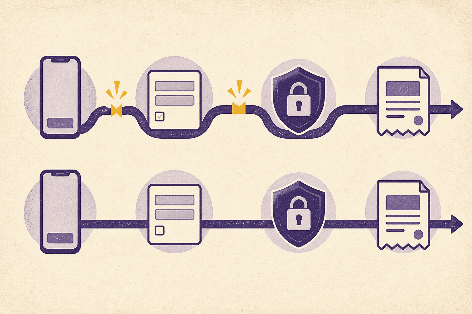
Most churches do not have a generosity problem on their donation page. They have a continuity problem.
A person decides to give in one context and is asked to complete the decision in another. The sermon names a specific need; the link opens a generic portal. The QR code is scanned on a phone; the form behaves like a desktop spreadsheet. The campaign promises immediacy; the confirmation email arrives looking like an accounting system.
The gap between intention and completion is the donation funnel. Improving it is less about persuasion than removing avoidable uncertainty.
Stage 1: the invitation
Every gift begins with an invitation: support this ministry, respond to this need, make giving a regular practice. A strong invitation answers what the money is for and why the moment matters. The product’s job is to carry that meaning forward.
Use campaign-specific links and QR codes. Preserve the selected fund when the page opens. Keep naming consistent across the announcement, landing page, form, receipt, and finance report. “Community Pantry” should not become “Outreach 04” halfway through the experience.
What to measure:
- visits by source;
- device type;
- campaign and fund;
- time from invitation to page load.
Do not append personal or sensitive information to public URLs. Attribution should help the team understand channels, not expose donors.
Stage 2: the landing moment
The first screen should confirm that the person is in the right place. Show the church identity, the campaign or fund, a brief purpose statement, and a clear way to begin. Avoid competing navigation, autoplay media, and a wall of explanatory copy.
Performance is part of trust here. A heavy hero video or several marketing trackers can make a simple giving page feel broken on a poor connection. Test on an ordinary phone using cellular data, not only on the office Wi-Fi.
A useful five-second test is blunt: can a new visitor identify the organization, purpose, amount action, and security context without scrolling?
Stage 3: amount and frequency
Suggested amounts reduce typing, but they should not manipulate. Always keep a clearly labeled custom option. Explain whether the gift is one-time or recurring before payment, and repeat the recurring schedule at confirmation.
If donors can help cover processing costs, make the choice genuinely optional and state the calculation clearly. A preselected fee option may increase short-term revenue while weakening trust.
Fund selection deserves restraint. A list of thirty internal funds pushes organizational complexity onto the donor. Feature the relevant choice, group the rest, and use language people outside the finance office understand.
What to measure:
- amount selection to form start;
- one-time versus recurring selection;
- custom-amount use;
- exits after fee or fund information appears.
These signals locate questions. They do not prove why a donor left; follow up with usability testing rather than guessing.
Stage 4: donor details
Every field spends a little trust. Ask what is required for the transaction, acknowledgment, and necessary recordkeeping. Move optional profile questions to a later step or a separate preference flow.
The W3C’s forms guidance recommends simple forms, explicit labels, clear instructions, and useful feedback. It also notes that excessive questions make abandonment more likely. For churches, accessible implementation is pastoral as well as technical: older donors, keyboard users, screen-reader users, and people with limited dexterity should not face a second-class path.
Test at minimum:
- visible labels that do not disappear when typing;
- logical keyboard order;
- large tap targets;
- autofill for name, email, and address;
- errors announced and placed beside the relevant field;
- entered values preserved after an error;
- sufficient contrast at normal and enlarged text sizes.
Stage 5: payment
The safest card field is one the church does not build or store itself. Use a reputable payment provider and understand which party hosts every payment-page element.
PCI guidance makes implementation details consequential. Fully outsourcing payment functions can reduce the church’s card-data exposure, while embedded scripts and merchant-controlled elements may bring additional obligations. The church should confirm its compliance path with its payment provider or adviser, keep its own site patched, protect administrator accounts, and monitor changes to payment code.
Offer familiar payment methods when the audience needs them, but do not turn the page into a logo collection. The interface should remain quiet and predictable.
What to measure:
- payment attempts and completions;
- error category without recording sensitive card data;
- completion by payment method and device;
- processing time;
- duplicate submissions and refunds.
Stage 6: confirmation
A spinner that disappears is not confirmation. Show a durable success state with the amount, fund, frequency, date, and next expected charge where applicable. Send a receipt promptly, and give the donor a way to get help.
In the United States, donors need written records for monetary contributions, and contributions of $250 or more require a contemporaneous written acknowledgment containing particular details. The IRS lists those requirements; the church’s finance or tax adviser should approve the final receipt language and process.
This moment can include one restrained next step—such as managing the gift or learning about the supported ministry—but gratitude should remain the focus. A completed donation is not permission to add every donor to every marketing list.
Stage 7: reconciliation and care
The donor sees one transaction. Staff may see a payment, fee, settlement, person match, fund entry, receipt, and bank deposit. If those records do not reconcile, the giving experience is not finished.
Create a routine for unmatched donors, failed receipts, refunds, chargebacks, and recurring-payment failures. Assign ownership. A dashboard nobody checks is not a control.
Track a small set of outcomes over time:
- completion rate from the giving page;
- recurring gifts started and stopped;
- failed payments recovered;
- unmatched transactions;
- receipt delivery failures;
- time required to reconcile a settlement.
Fix friction in the right order
Start with broken and ambiguous moments before experimenting with copy or suggested amounts:
- Payment or receipt failures.
- Mobile and accessibility blockers.
- Confusing funds, fees, and recurring terms.
- Unnecessary fields and account creation.
- Performance and visual polish.
Then observe real people using the flow. Five careful sessions often reveal issues that aggregate analytics cannot explain.
A better donation funnel does not pressure people into giving. It removes the product’s excuses for getting in their way.